Fisher-Price & Homer: Learn&Play
Project Overview
The Why & What
Our partnership goals were to capture Fisher-Price awareness and reach, as well as to drive conversions to the core HOMER app. The main objectives we were given were to help both brands build a deep foundational relationship with consumers through a safe digital experience to provide a healthy start to learning for a young audience.The product purpose of the app was to help parents who were looking for a way to successfully and safely occupy their 6 month to 36 month old children, so they can get through quick chores, or work. If the content is enriching, parents consider it a bonus.
We spent two months gathering competitive data and current data for Fisher-Price apps, to help guide the business and other product strategy necessary. We decided we had a lot of questions on who these parents were we were targeting so we ran several phases of research through the project. These included: qualitative parent interviews, weekly playtesting and usability testing with children and parents, and a formal diary study at the end of our Beta release.
Product Approach
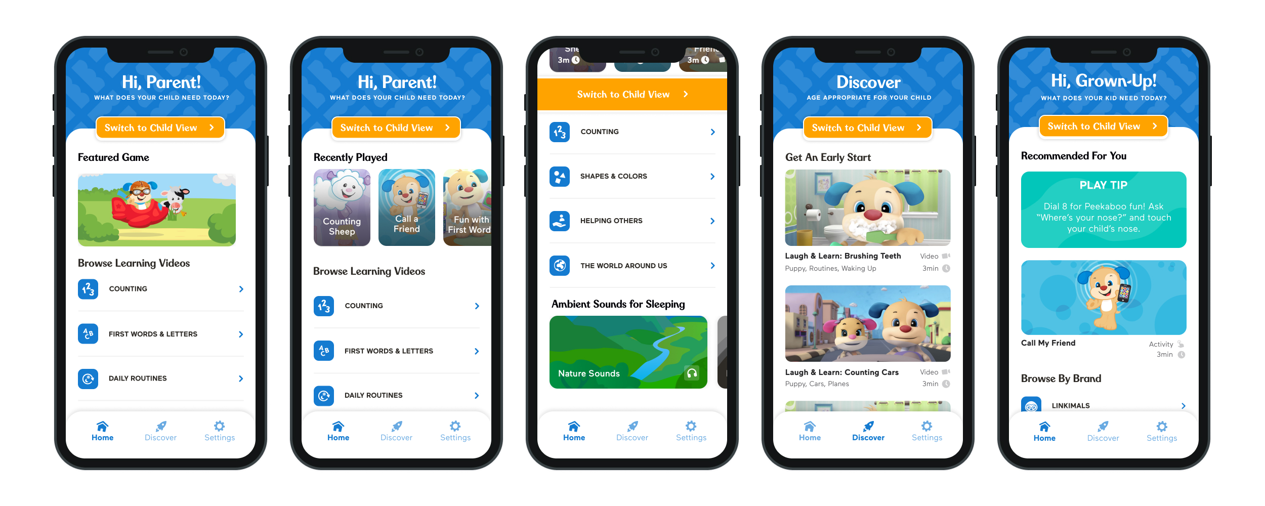
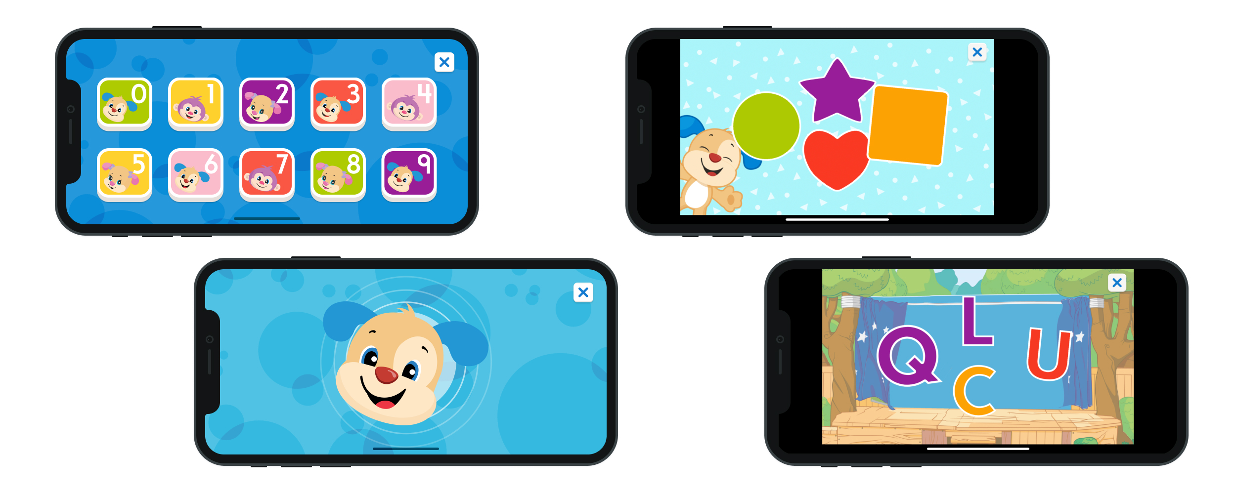
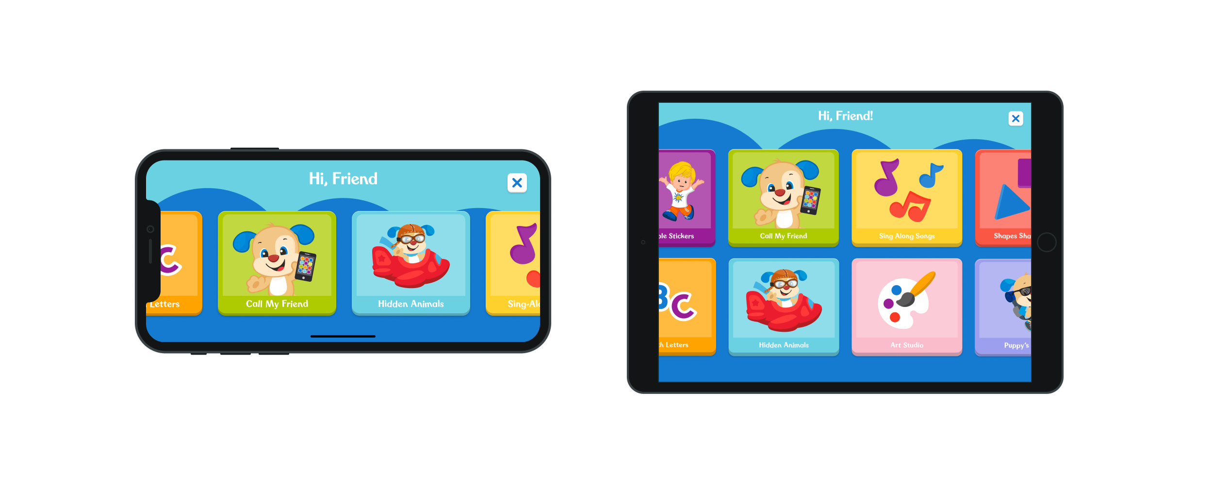
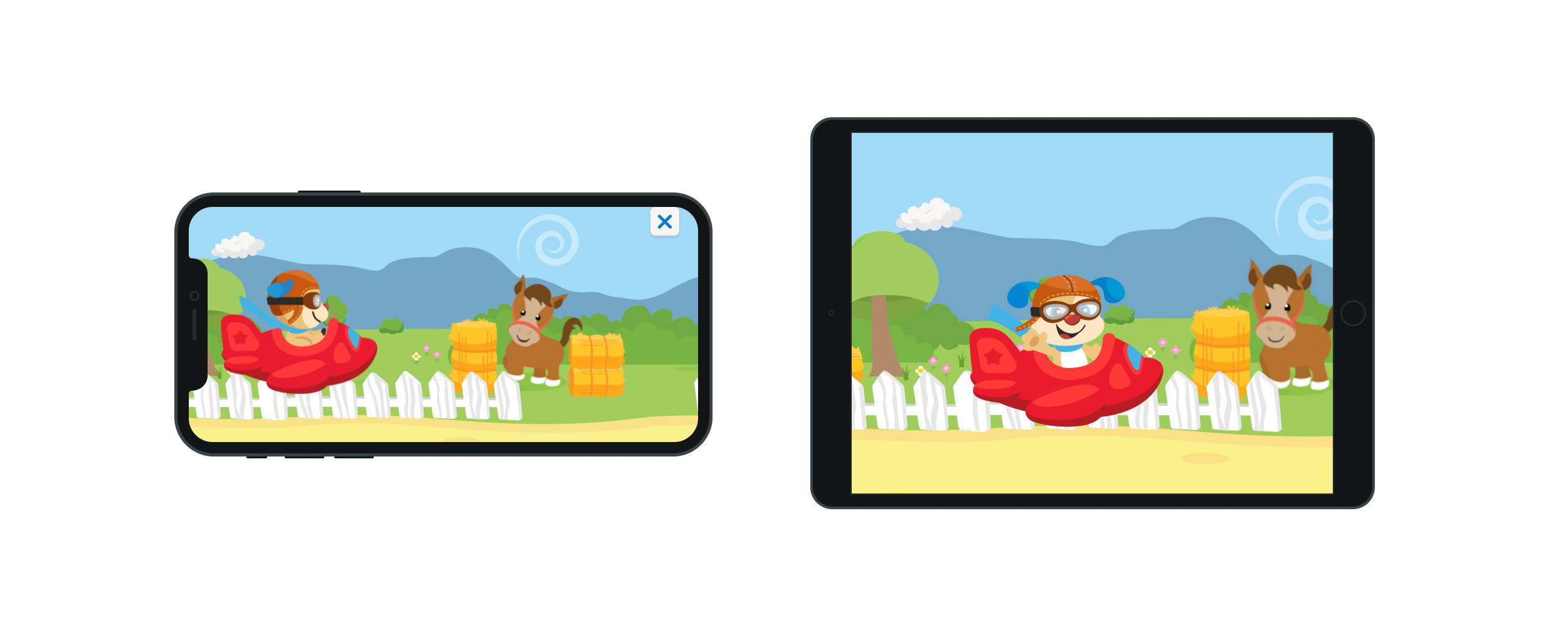
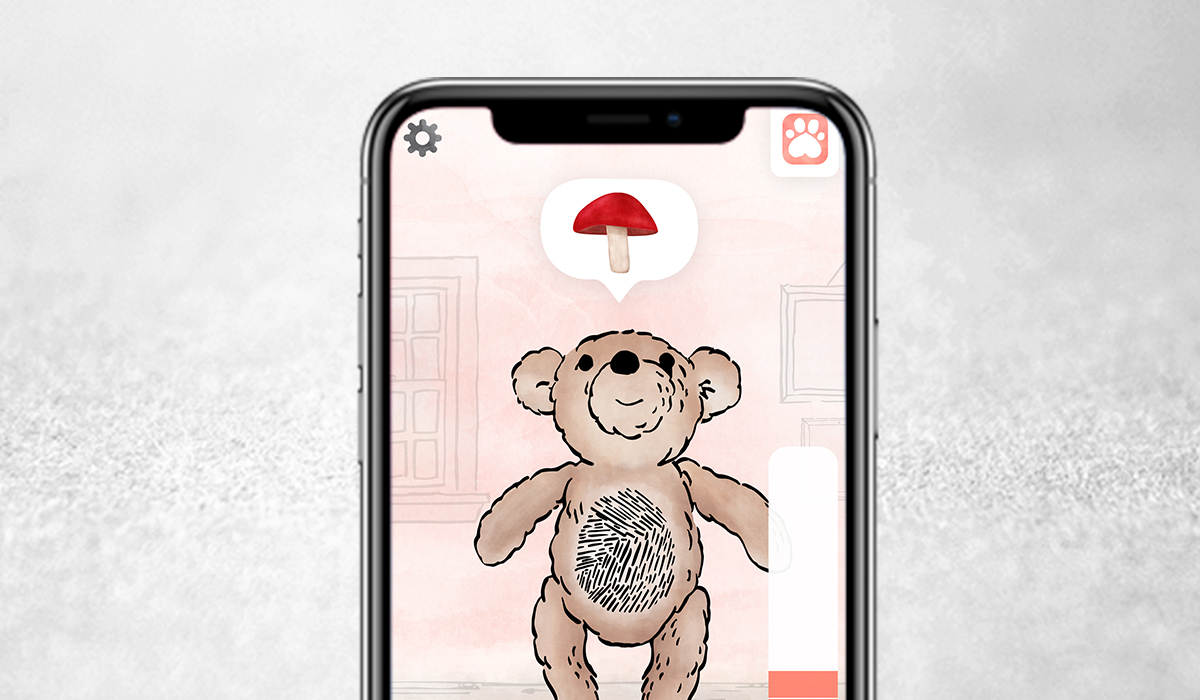
We focused our energies on a 1-2-3 routine for families through the concepts of exploring, interacting and soothing content. We came up with three different types of content that could be used through the day: videos, games, and audio-forward sounds. While videos were already provided by Fisher-Price, we created original activity content just for the age group, from simple sticker activities to more interactive and playful shape, letter and animal games. The idea based on our research was that early morning routines could be amplified with simple video songs, to the more rewarding play time of games, and then the quiet audio ambiences for bedtime (or nap time).
UX Strategy Point: Parent & Child Use Cases
Due to the age range we were targeting, we hypothesized, and then validated through research that the app would need to be something either a parent or child could drive. Parents would need help categorizing and finding content right away to satisfy their concerns on safety and enriching, as well as the ability to let the child lead their own play time for a few minutes. The concept proved to be a challenging one, as we tried to demonstrate to parents through visual cues, sounds and language that the app would be locked in a child view if they handed it off but also used in family time.
UX Strategy Point: Don't Block Out Users
From our Beta release and Diary Study, we learned users struggled with account creation - not that they couldn't do it, but that they didn't want to create an account before they could view the content (Seems pretty standard right?). We knew from previous research that the app needed to be free, but business needs required us to further push for emails to maintain a connection with our new Fisher-Price families. After testing a few prototypes, we were able to come up with a solution to let parents "Skip & Explore" the app for a limited amount of views before we required an account.
My team tended to "parallel work" - We left video calls open even when the meeting was over. It helped us continue the flow, get feedback on the fly. It ended up helping us build a strong working relationship and friendship that we maintain despite working at different companies today.`
Project Basics
- Duration: Beta: Dec 2019 - March 2020; MVP: April 2020 - August 2020
- What I did: Design & Product Strategy, User Research, Full UI/UX Design, Animation, Game UX & Design, Asset Production & Developer Collaborations - iOS & Android, Content Creation/Ideation, Product Demos
- Programs Used: Figma, After Effects, Illustrator
- Links: Learn&Play @ HOMER
In 5 days I designed and ran qualitative interviews parents of children ages 0-3, to learn the user needs that ultimately drove the product, design, and learning strategy of the product.
Diary Study: Learnings from Parents and Kids
The goal of the diary study was to gain insight into the role the product plays in a family’s lifestyle/routine in order to identify elements of the app that may be viewed as ‘premium’, and develop personas to further understand the parents of 6m-36m children.
The Parents: We learned that the parents discovered what their kids likes, grow their interests through activities, including digital no matter what age. Most of the families were play-focused, with an eye on content that leans more educational. Typically these parents use their children's mood to drive screen time routines, with some limitations during their downtime or when parents really have to get things done. Several parents also started learning time during their morning, but also because these were at the start of covid, this made a larger impact on the families routines in general. Free content was the most desired type, and these parents would only pay for content if their child showed a prolonged interest in an experience.
The Kids: Children were asking and wanting to play with the app daily. A few began to demonstrate an understanding and connection to the content by communicating with noises; note: these were very young children, some who hadn't even started speaking yet. The children responded fondly to the characters in the games, especially the ones closer to 2 and 3 who had Fisher-Price toys already. They also let the app drive their routines and activities throughout daily play, and for when the child asked for downtime. At the end of it, children know what they want to play, when they want to play and learned easily what was too hard or too easy for them to do, despite their young ages.
